
(Part 2. click to read part-1 ).
As it was mentioned in Part 1, rules of conceptual and composition principals are universal for all kinds of visual art, including design. Using the techniques of composition, the artist can manipulate the viewer’s eye, directing it to the important parts of the picture and creating the appropriate effect and mood.
Let’s look at a few more examples to help track how this technique has evolved in different styles and eras without diving too deeply into the actual content.
lt is fair to say that the search for visual techniques used for better identification of content of painting and psychological portraits began long before Leonardo. Strictly speaking. art critics count modern European art beginning not with Leonardo but from Giotto, who probably first began to grope for new methods of expressing space and composition two centuries before.
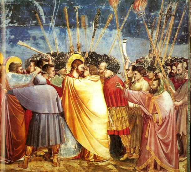
Here is a famous fresco “kiss of Judas” by Giotto di Bondone. ln the main action. as described in the mural and at a central location of the composition, can be seen the treacherous kiss. And literally all navigation arrows and the views of almost all or the characters, including the male standing on the right and making the pointing gesture, focus upon and are meant to manipulate the eye of the spectator and redirect it to the main point. In this case two faces, two worlds, two opposites, Judas and Christ.

Speaking of portraits, here are the same principles used to identify the main issue in a picture: Linear and tonal accents are directing the viewer’s gaze to the most important areas of the canvas. On the left there is a portrait of Doge Leonardo Loredan, by Bellini, painted two years before the Mona Lisa. Notice the shoulder line and the same folds, venetian red bands above and below the ochre face on a background of sky blue contrasting especially on the face. Or on the right, the male portrait by Van Eyck, painted in 1436, which came 67 years before Leonardo’s Mona Lisa (1503), where the composition gravitates toward the psychological portrait, and not just to the formal description of the object.


And look at the portrait of Giuliano de’Medici brushed by Botticelli with its framed picture of the face as if it were isolated in a separate frame. It looks more than just a revival, it looks almost like an avant-garde. We can also mention Hans Memling, who frequently put the landscape in the middle of the portrait and not to the side as done by many in the 15th century. Finally, the “Portrait of a Young Man” by Punterikkio (1481-83), that is 20 years before our Mona Lisa. Within these portraits are almost all of the applied techniques that Leonardo simply, definitively and clearly formulated.
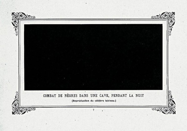
Similarly, the reception of a Black Square is not entirely new. The famous artist, publicist and public figure, an eccentric philosopher and humorist, perhaps the first real avant-garde contemporary artist, Alphonse Allais, painted his “Negroes Fighting in a Cave, in the Nighttime,” in 1897 (the lost original came even earlier in 1882, about 30 or so years before Malevich).

But just as in the case of Bellini and Van Eyck, while the new forms can already be sensed here, they have not been finalized. Everything is presented as a magnificent joke. On the left- “Apoplectic Cardinals Harvesting Tomatoes by the Shore of the Red Sea”. And on the right- “Pale Young Girls Going to their First Communion in the Snow” 1883 (version 1897). With Malevich everything is made very serious. Especially the square, and especially because it is man-made, because in our world everything is a little bit shifted, because our perspective always has some distorted representation …
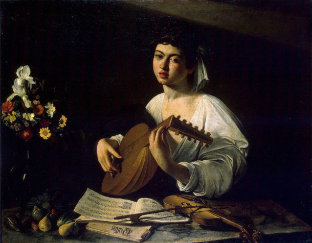
A perfect example of fluent technique to control the viewer’s eye: On the bottom left comer one’s view slides along the lines of notepaper to the bow and the violin, which then moves to the light line taking on a chord brush, and then to the face. Next, folds of the white shirt, the light spots of the hand brush and the same musical page do not allow the view to “go out of range”. Then the folds of the white shirt the light spots from the hand brush and the same note pages do not allow one’s view to “go outside the range”.

Here is another example of using this technique. The task of the artist is to rivet the viewer’s eye to the full horror of the father’s eyes and blood on his temple. The small circle-his father’s eyes, fingers and trickles of blood, the eyes of the dying son, his fingers and his father’s eyes. Large circle-his father’s eyes, fingers and trickles of blood, the left hand of the son, carpet patterns or thrown to the side a walking stick, folds of the next rug, Lines of light along the leg of the son, the hand of the father-the lineup, and again the eyes of the father. As far as this picture is concerned one could write a separate, extensive article. To start, at least, with the fact that the story is not quite clear, and in real life Ivan the Terrible’s son may be died under very different circumstances. We can also recall how people were seen to be weeping, standing at the canvas, as if spellbound. And once the picture was attacked by an onlooker with a knife … but that’s for another time.
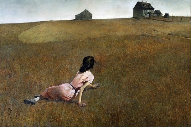
Completion of the classical era does not mean the end of an era of using classical techniques. Simply these techniques have acquired a new resonance from the masters of the 20th century. How brilliantly the artist portrayed the world of the girl, Anna Christina Olson, suffering from polio. Here we see a little piece of heaven, a pair of shabby buildings, and the world of earth and grass, full with some kind of its own life. But in this case, the artist concentrates the viewer’s attention not on some important particular points on a canvas. Instead he spreads it over an extremely detailed and huge plane showing soil covered with busy grass. As a result, we, like the pictured girl, feel an enhanced gravitation of both the earth and the world of meadows next to her lonely native home. While looking at this, l recall the protagonist being played by actor Solonitsin in Tarkovsky’s movie “The Mirror” (1975), when he suddenly loses his footing, falls and begins to notice the life of some other world; the world of herbs, which was hitherto unknown to him.
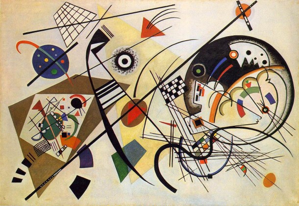
Talking about Malevich, we cannot forget another master of Russian avant-garde – Wassily Kandinsky. However, he acts in a diametrically opposite direction. In his compositions, sometimes it does not collect and forward, and as it were the other way around-artfully spray the viewer’s attention to force him to look around. But often, for the external chaos and spontaneity, it is a clever technique of ownership composition. By rejecting a narrative’s recognizable realities the artist manages to manipulate the viewer’s attention by abstract lines, spots and figures. He then reassembles their attention, but not on the languid face of a young boy nor the crazed eyes of the father, like it was on the Repin’s piece, we discussed above, but on the random abstracted element, like line in this case.

And now, when we see that composition does not need a recognizable reality, I could not forget to include an example in architecture. We can see once again that classical aesthetic and compositional techniques work not only in painting and clothing design but are also universal for any type of aesthetic design. The vertical line of the tower, textured by horizontal lines of quarry stone and window mullions, is syncopated, interrupted by smooth horizontal lines of concrete parapets, and poured into a live flowing curve of rattling water. Moreover, all of this is three-dimensional, which adds an additional charm to its wonderful composition. The building, as it arises from nature, at the same time grows into nature. It is on the one hand the crown of this particular landscape and on the other hand-and on the contrary-its support and organic part.
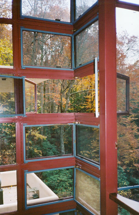
To achieve the desired effect, Wright came up with a special design of a comer window, where the same corner is itself free of the massive supporting column and the comer window frame, which would have interrupted the horizontal orientation of the window mullions. In addition, he basically violated the safety issue, substantially underestimating the height of the parapets on the terraces themselves, to preserve the necessary proportions for the horizontal nature of the concrete interruptions. Bold, arguably, but with a very strong aesthetic technique, this piece emphasizes the main concept of the house-not to interrupt, not to ignore, but to enhance the beauty of the natural world.
Actually, the customer initially intended to build the house exactly at the place where one can now find a viewing platform, where this photograph was taken. He probably dreamed of sitting by the fireplace in a cozy room and admiring the wonderful waterfall. But Wright never learned to be a “servant of the client” On the contrary, he turned his customers into slaves of his revolutionary concepts, and often, customers gave up their guts. Instead of a cozy comer with a sweet view, he built a beautiful but harsh lair with low ceilings and open space; instead of traditional solid walls, glass walls and low ceilings squeeze people out into nature. People are pushed from the interior world to the exterior of nature. But the pleasant landscape was turned into such beauty that it has become a place of pilgrimage not only for architects, but also for ordinary tourists and appreciators of beauty from around the world.
The artist managed to come up with an interesting, profound and poignant melody in the frozen music of architecture, and executed it brilliantly.
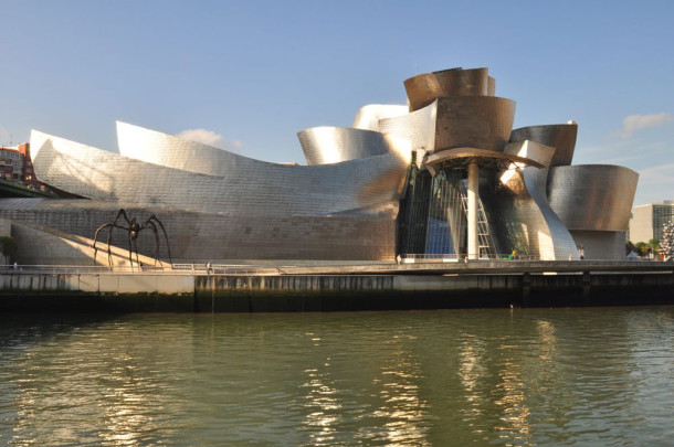
Here is another shining example of the use of compositional techniques for the expression of interesting concepts. Curved ribbons of solid walls, as if in a free dance, visually gather the content (art) in a single bundle, and then seeming fireworks splash it out to the world. As we can see, there exist the same compositional techniques and tools such as rhythm, direction of the viewer’s gaze to where the artist intended, and thoughtful accents; but at the same time there is a whole new resonance of meaning, new rhythms, and a new character added to the melody.

There is another quality and in it is seen that something new is arising, but there is no “style” for this yet-new art, just like the “Black Square”-that is unclear, brutal, pointed and chaotic. All of these characteristics apply to the sculptural form of the building itself. The whole design of the building and its formative concept is “Inspired by Art”.
In conclusion, all of the described methods are common to all types of art. They are like the laws of nature operating regardless of time, style, technology and type of design. This can be in a sculpture or a painting, in clothing and home furnishings, or in gazebos or skyscrapers. These methods work independently; consciously or unconsciously they have been used by the artist, and it doesn’t matter if the artists or the viewers know about this natural law of composition. Because it is a natural Jaw, it exists anyway. And of course everything which we discussed today is also “Inspired by Art”.
Afterword:
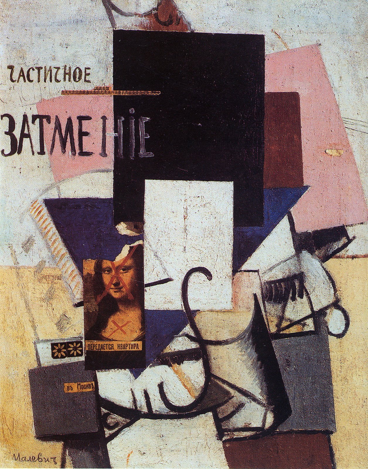
Ironically one of Malevich’s paintings titled, “The composition with Mona Lisa” in which poor ladies were crossed out with bold headlines with red paint and overshadowed abstract geometric planes, also symbolized these new forms of art. And this picture, by the way, preceded the beginning of the period of his abstract Suprematism. At the same time, one of the last paintings by Malevich – a self-portrait, is performed in particular in the revival style, although in the lower right corner, instead of a signature is a black square.

Thus, the article could be the subtitle phrase-“From Leonardo to Malevich and back”.
One thought on “The “Inspired by Art” competition. From Leonardo to Malevich -The Concept and Composition in the design world (part 2)”